While serving as Art Director at Group 5 Advertising, I led the creative development of a new brand identity for Charles Perry Partners, Inc. (CPPI). Through a series of client discovery sessions, it became clear that Charles wasn't looking for a logo that simply represented construction—he wanted a symbol that reflected the culture he hoped to build. His vision was to create a company that felt like family and he wanted the identity to carry a deeper meaning for the people who worked there every day.
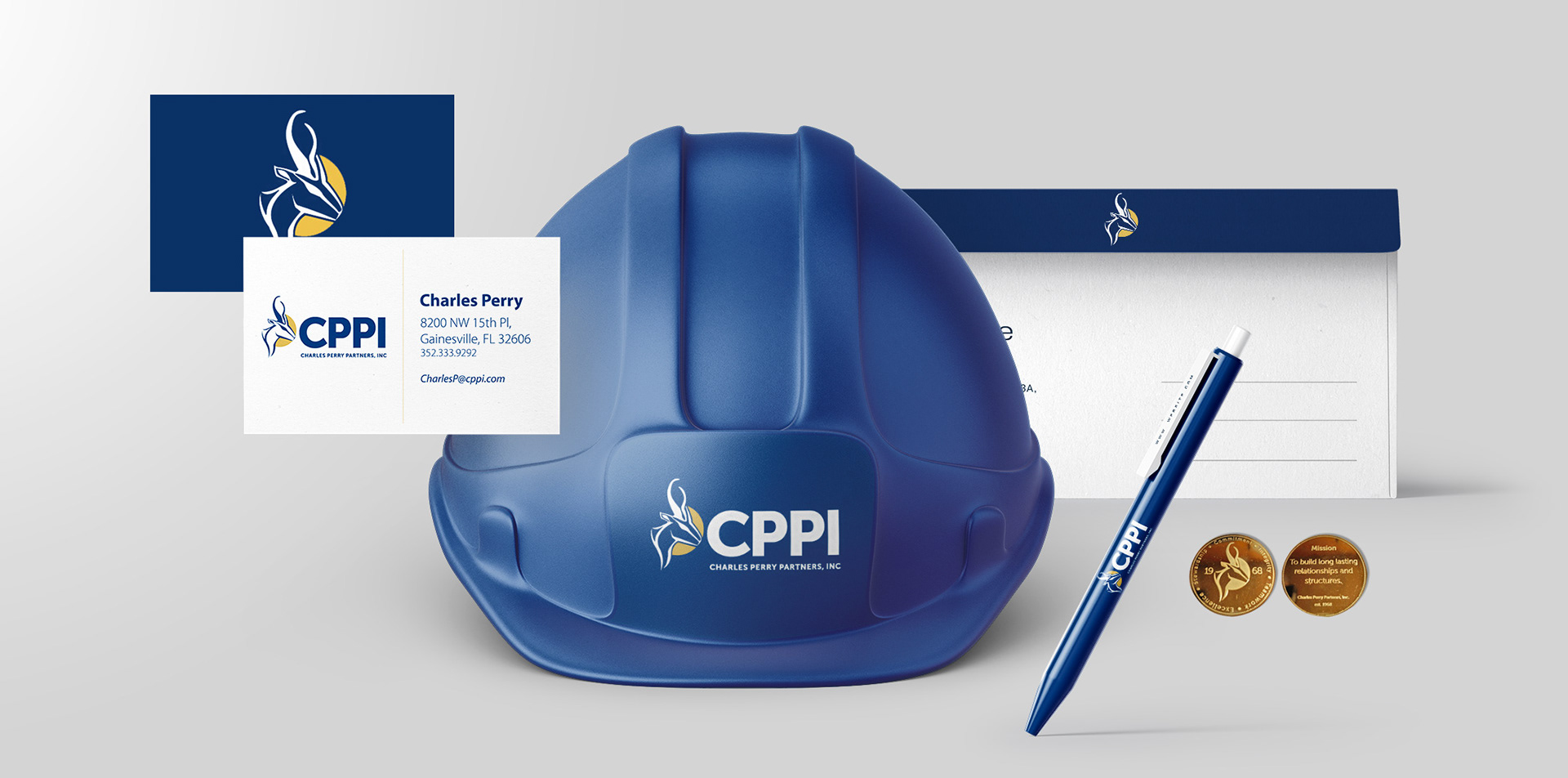
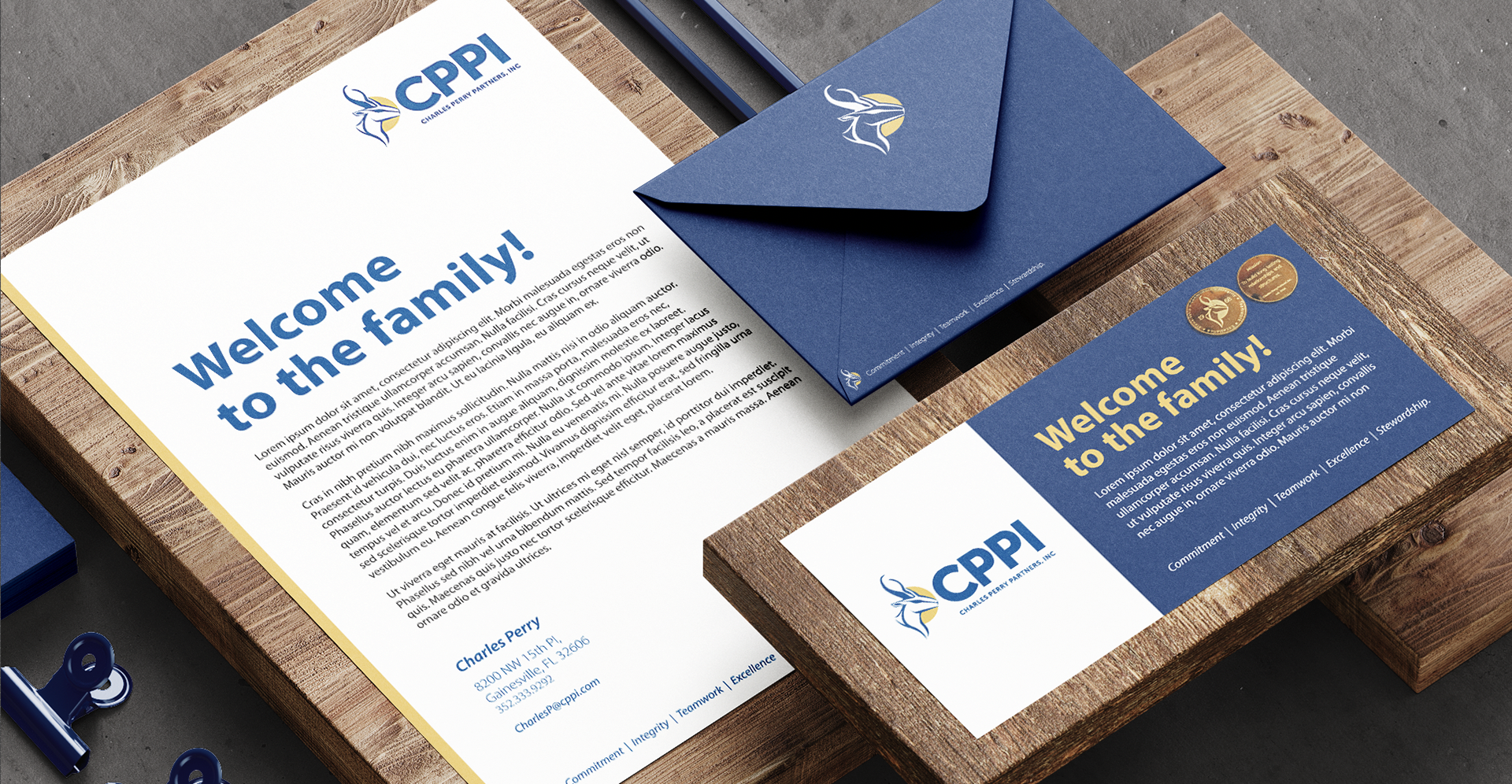
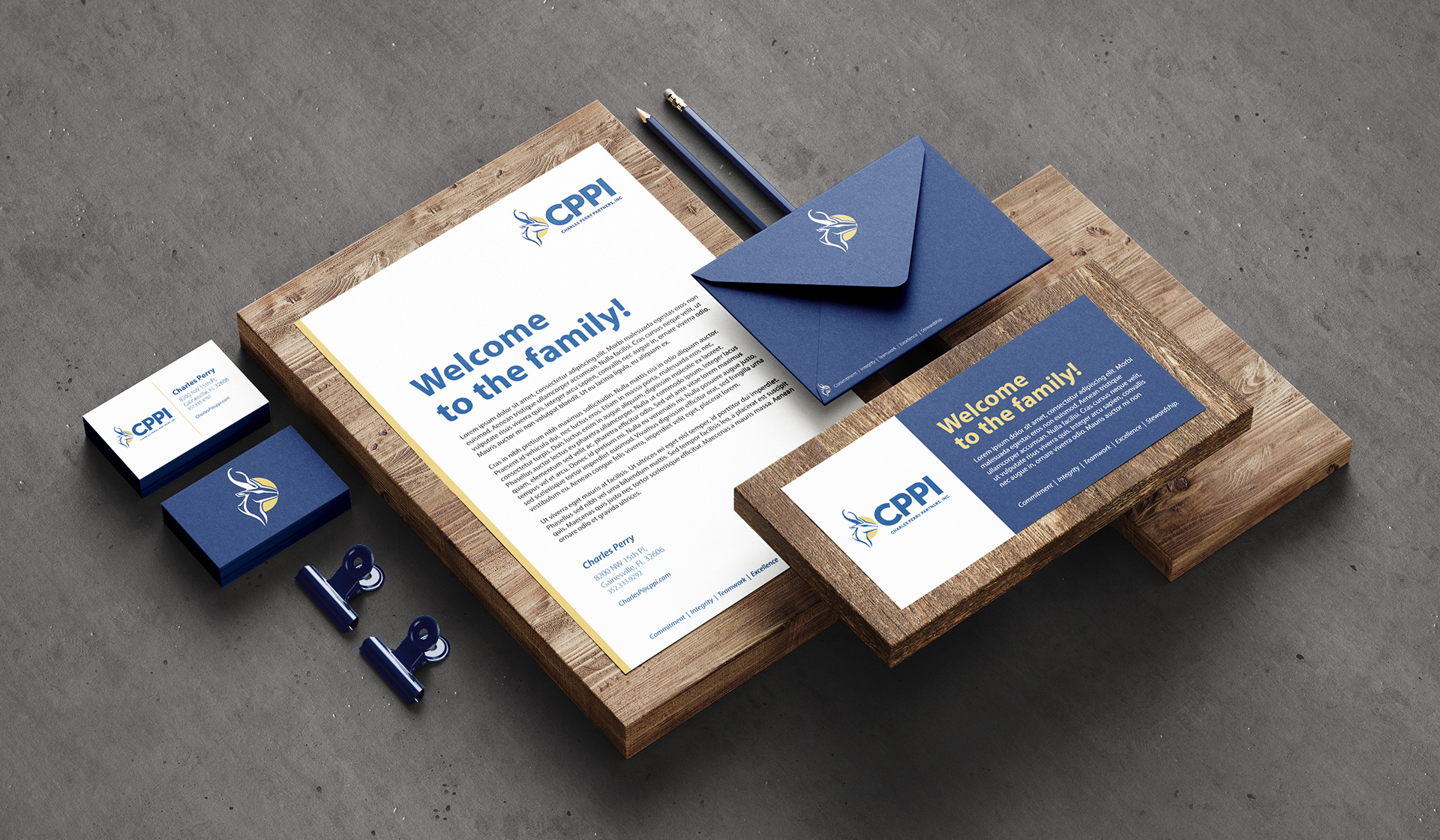
Those conversations revealed the story behind a treasured South African coin featuring a springbok, a keepsake passed down from his father that had become a meaningful symbol for his family and represented cherished memories of traveling together in South Africa. Rather than relying on familiar construction imagery, I translated that deeply personal story into a distinctive brand identity that embodied heritage, trust, unity and legacy. While I explored numerous creative directions, the springbok concept immediately resonated with Charles and ultimately became the company's enduring identity.
One of my favorite aspects of this project is what happens when I'm out in the world. CPPI is everywhere and I get the chance to hearing people ask why a construction company would choose a springbok instead of a building or crane. It creates an opportunity to explain something I believe is fundamental to effective branding: not every logo is designed to tell the public what a company does. Sometimes a brand mark exists to remind the people inside the organization who they are. For CPPI, the springbok became an internal symbol of family, shared values and company culture. A mark that carries meaning because of the story behind it.
To me, that's one of the most powerful roles a brand identity can play.
To me, that's one of the most powerful roles a brand identity can play.